Evaluation
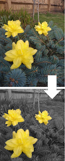 The main subject of this photo of this
photo is the flower in the foreground of the photo. There are two other flowers
in the background to make the photo more interesting and less empty.
The main subject of this photo of this
photo is the flower in the foreground of the photo. There are two other flowers
in the background to make the photo more interesting and less empty.Focus is drawn to the main subject in this photo as everything else has been turned black and white. This draws your attention to the main subject as you look straight at the coloured parts of the photo. Focus is also drawn to the main aspect of the photo as the flowers are fully in the photo and not cut of by the edges of the photo.
This picture works well as the shapes of the flower stand out well from the bush below where there are no obvious shapes that you can see. The photo also works well because of the contrast between the textures that I have previously mentioned.
This photo could be improved by having more definition on the flowers in the photo. Also if there was more shadowing on the flowers the photo would look better. This could be improved in Photoshop by adding drop shadows on some of the petals in the flower.
Daniel likes this photo as the yellow from the flower stands out very well and bring attention to it. However he does not like that there is not much detail visible in the photos due to the poor camera. To improve this I would use a higher quality camera with more resolution.
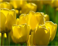 My photo does not look as
good as this professional photograph as the flowers in my photo do not have the
shadowing that appears in this photo. However my photograph looks quite good
compared to this photo, as it does not have as much in the foreground.
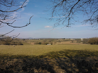 The main subject of this photograph is the horizontal
line where the sky meets the land (horizon). I took this photo, as I like
how the branches at the top of the screen show a sense of depth in the photo
and how the hill curves down and then rolls back up further away.
The main subject of this photograph is the horizontal
line where the sky meets the land (horizon). I took this photo, as I like
how the branches at the top of the screen show a sense of depth in the photo
and how the hill curves down and then rolls back up further away.The elements of this photo that make it work are the horizontal lines that lead up to the horizon that are contrasted by the zigzags of the branches. The green colours of the grass contrast the bright blue colours of the sky, this makes the photo work well.
This photo could be improved by adding something in the bottom foreground to add a greater sense of depth. The horizon line (main subject) could be moved up or down to follow the rule of thirds.
People like this photo because the branches creep over the photo and the shadow that intrudes at the bottom of the photo, however people do not like the houses in the background because they draw attention away from the main subject in the photo.
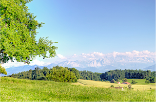 This professional
photo is better than my photo as the colours are a lot brighter than mine. To
improve my photograph I would increase the contrast of the colours to give it
the brighter look. This photo is also better because the horizon line
follows the rule of thirds. To improve my photo I would crop the photo to get
rid of some of the grass, making the photograph follow the rule of thirds. In
the professional photo like that the hill slopes down to the right as it makes
the photo look more interesting. The background of the professional photo is
also better as the mountains are clouded out, so they do not take attention
away from the main subject of the photo. I could add that effect to my photo in
Photoshop to improve it.
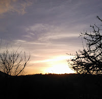 The main subject of this photo is the sunlight braking through the branches
of the tree. I took this photo as I thought it was a good opportunity to get a
good photo of silhouetted branches in front of the sun. The photo attracts
attention to the main subject as all other things in the photo are silhouetted
and the only colour is the sun and sky. The main subjects of this photo are the
ruff textures of the branches growing off of the tree trunk and the contrasting
smooth look of the sun. The curved line that goes around the sun also contrasts
the sharp lines from the branches that cut into the screen. This photo could be
improved by reducing some of the sun glare.
 Other people think that this photo is good because of the silhouetted branches that come across the screen; they also like how the yellow sun is the only colour in the photo. However people do not the amount of sun glare in the photo, a little bit is ok but there is too much in this photo.
 This professional photo is better than my photo because the colours coming
from the sun are a lot sharper and richer than the colours coming from the sun
in my photo. If I were to merge in some reds into the sunset using Photoshop my
photo would be a lot better. The way the trees reach up in the sky in the
professional photo is very good, but I could not achieve this in my photo, as
the trees are a different breed.
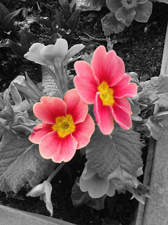 The main subject in this photo is the
two red flowers in the centre of the photo.
The main subject in this photo is the
two red flowers in the centre of the photo.I took this photo as I like that the flowers are thin but the plant still bulges out in the photo.
Attention is drawn to the main subject of the photo in the same ways as the first photo that I evaluated, the flowers are the only things in colour thus drawing attention to them. Attention is also drawn to the flowers, as they are not split by the edges of the photo.
The main aspects of the photo are the contrasting textures between the smooth leaf and the grainy soil. Also the contrasting red colour of the flower and the black and white everything else.
This photo could be improved by cropping the photo to make the flowers seem larger. I could also improve the photo by blurring out the background just be hind the flower to draw more attention to the flowers.
People think that my is good because of the red flower being the only thing in colour and how the plant bulges out of the photo. However people do not like this photo because the background is still in focus and draws attention away from the main subject in the photo.
My photo compares quite well with this photo as the colours are similar and the black and white effects are done well. However in the professional photo the background is blurred unlike in my photo making mine look worse. To improve my photo I would do as previously mentioned, us Photoshop to blur the background out. But I think my photo is better than this one.
